Best Paint Colors
January 14, 2021
Discover House & Home’s Top Paint Trends For 2021
New year, new hue! Refreshing our rooms this year is all about bringing a sense of optimism and comfort. These livable paint colors are fresh, sophisticated and grounded. From must-have neutrals to the new millennial pink, scroll down to discover the hottest 2021 paint trends.
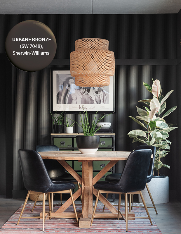
Rooted in nature, Urbane Bronze makes us feel connected to the earth. This rich neutral is Sherwin-Williams’ pick for Color of the Year; it creates a cocooning feel that would work well in many rooms, especially those with plenty of natural light.

Our love affair with neutrals sees no sign of cooling off. This smoky, silver-tinged hue is a great alternative to stark white. It travels well around the house as a wall color or as trim, and pairs nicely with both warm and cool colors. It’s perfect for those who find creamy whites too yellow.
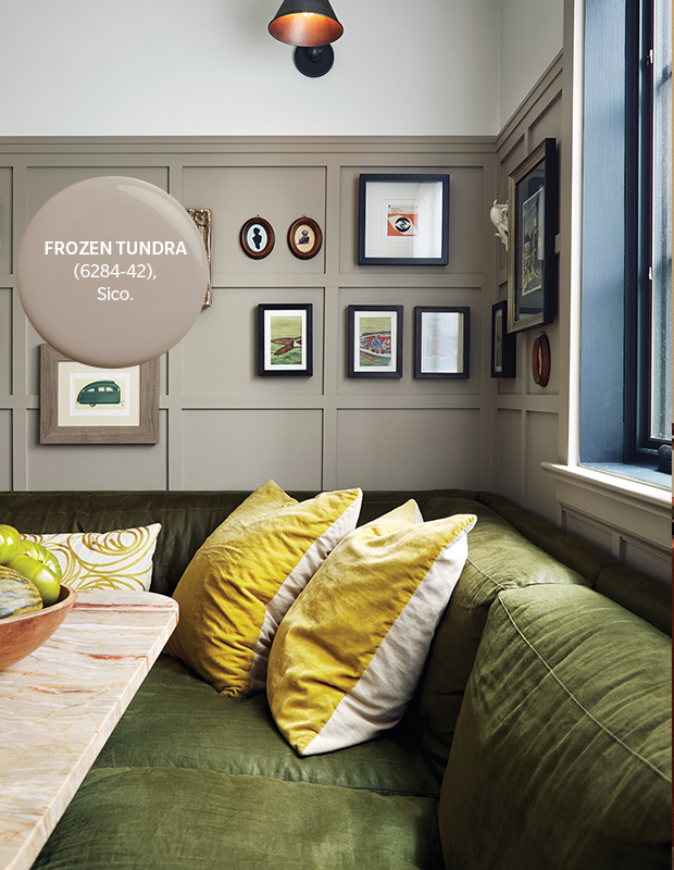
Taupe is making a comeback, and this soft, putty version feels fresh and new. Try it in a cozy breakfast nook to add depth and warmth to architectural panelling.
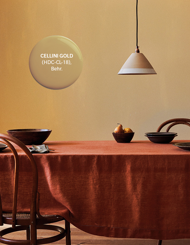
This warm, sunbaked yellow hue provides a taste of the travel destinations we’re craving. It’s slightly softer than the mustards and ochres that have been everywhere the past few years. Work it into minimally curated spaces to exude the richness its name implies.

While some may be suffering from millennial pink fatigue, the rosiness of blush continues to appeal in 2021, now in a deeper shade that’s closer to terracotta. Using it in a bathroom or powder room can make your reflection more flattering!
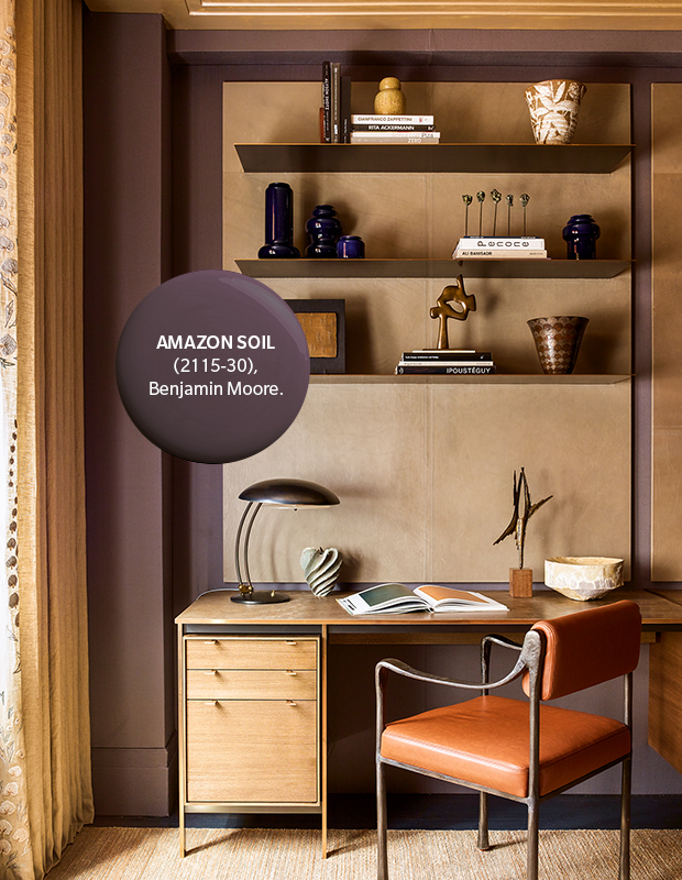
Frame spaces with this dark, velvety shade for added soul and warmth without the starkness of black. This not-quite-purple, not-quite-brown hue inspires a sense of quiet repose and comfort — perfect for a home office or bedroom. Pair with leather and natural woods for contrast.
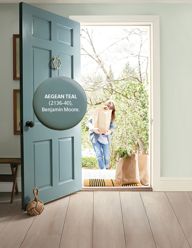
Benjamin Moore’s Colour of the Year is a new take on classic teal. This is a lighter version that feels harmonious and invites the chance to reflect and reset. Try it in small doses for a pop of color (like a front door) or in larger spaces to create a tranquil oasis.

More subdued than the brighter greens that were trending in 2020, paler greens will turn heads in 2021, offering a calm optimism. A fitting name for this hue, the jojoba plant’s oil is known for its ability to soothe, the same quality that this color brings to a space.
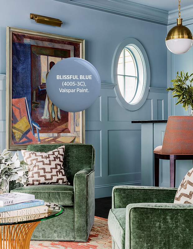
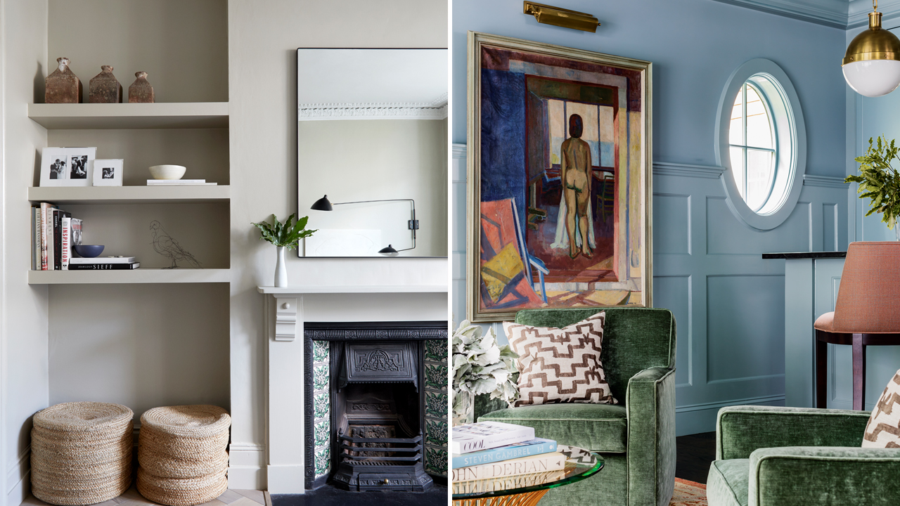
Blue is all grown up in 2021. Deemed by psychologists to be the color of productivity, this sophisticated take promotes calmness and concentration, ideal for a home office or living room. Plus, a hint of dustiness is enough for it to read as a neutral.
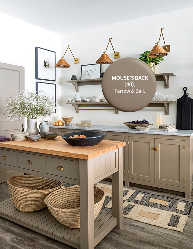
A favorite among Farrow & Ball followers, this historical hue is trending again as we seek a greater connection to nature. It works well in modern and country spaces, and pairs with warm metals like aged brass and natural materials, including jute. It reads greener in underlit areas and takes on a warmer tone in direct light.
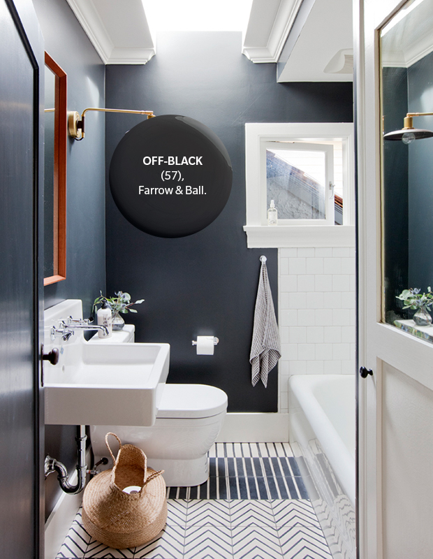
In contrast to true black, an off-black is a more livable option that adds a dose of fashion’s favorite hue without the severity. Use it in the bathroom — or anywhere — to add drama.
House & Home January/February 2021
Produced by Kai Ethier