Best Paint Colors
October 14, 2021
Color Crush: Olive Is A Versatile Neutral
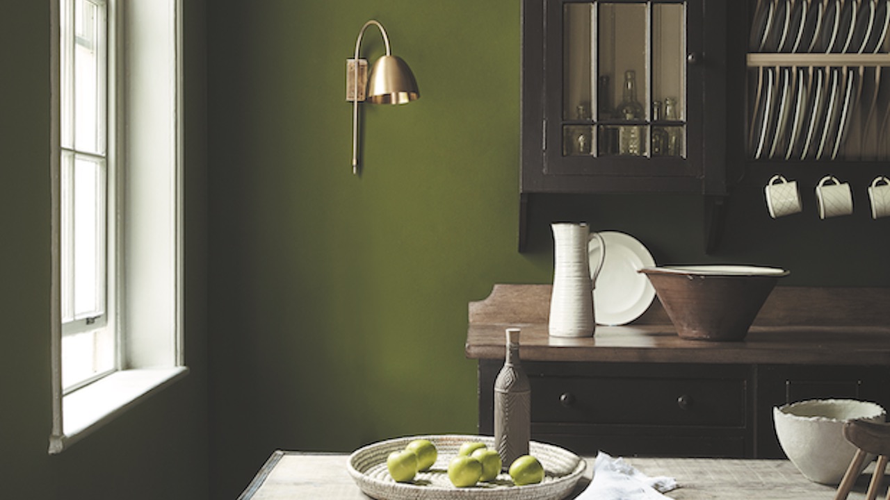
H&H design editor Rosemary Poole shares her favorite neutral to usher in the fall season.
With its rich, muddy undertones, olive can command a room but is equally content to play a supporting role for cheerful pastels, jewel tones and both dark and light woods. In this kitchen (above), a verdant shade of olive on the walls creates a sophisticated backdrop for off-black furniture, creamy white tableware and a brass sconce.
Scroll down to see how to use this cozy autumn hue in your home!
“Olive has a lovely enveloping quality that feels exactly right as the days grow shorter,” says H&H design editor Rosemary Poole.
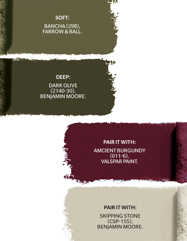
Soft: Bancha (298) by Farrow & Ball.
Deep: Dark Olive (2140-30), Benjamin Moore.
Pair It With: Ancient Burgundy (1011-6), Valspar Paint.
Pair It With: Skipping Stone (CSP-155), Benjamin Moore.
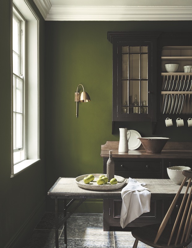
This dining room by British paint company Little Greene Paint & Paper puts olive front and center.
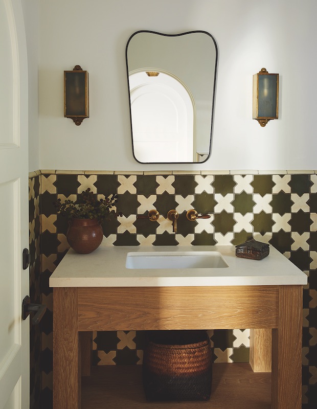
Handmade ceramic tile by Tabarka Studio adds visual depth to a bathroom designed by Krista Schrock and David John Dick of Disc Interiors. “We’re drawn toward the earthy greens with hints of grey and brown,” says David. “They feel restorative, calming and natural.”

A bistro-style kitchen gets a jolt of warmth thanks to the beige-green panelling and green banquette.
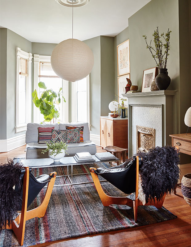
“After years of living with white walls, I painted the living room in Pigeon by Farrow & Ball and replaced the traditional chandelier with a Noguchi pendant,” says Emma Reddington of her soft green living room.
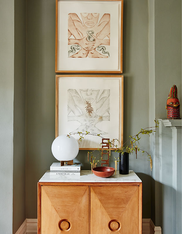
“The trouble with being a design editor is that you end up loving many different styles, but the result is wonderfully eclectic vignettes,” Emma says of this grouping in her living room. The beauty of this greyed version of olive is that it looks softly faded or aged, so it’s the perfect backdrop for vintage finds.
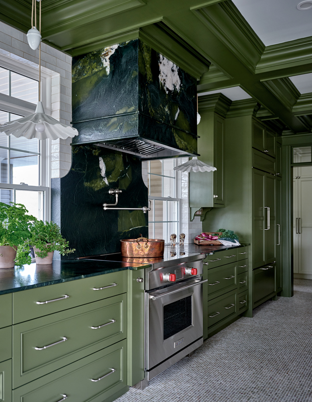
Hard-wearing Avocado quartzite stone has rich olive undertones to complement the deep olive cabinetry.
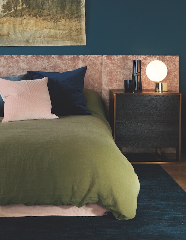
Prepare for hibernation with a calming combo of olive green, warm pink and petrol blue. This trio of shades are classic and balance each other out since they have a similar value, or color intensity.
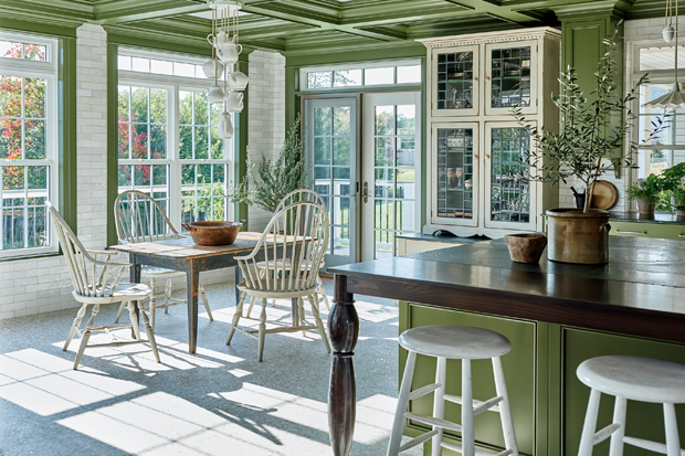
“It’s a modern version of avocado,” says Nova Scotian designer Jonathan Legate of his client’s kitchen painted in Benjamin Moore’s Bonsai.
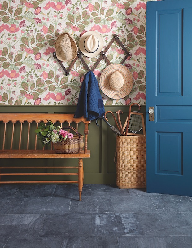
Long associated with army fatigues and wellies, olive green is steeped in British heritage. Here wainscotting is painted in Benjamin Moore’s Turtle Green.
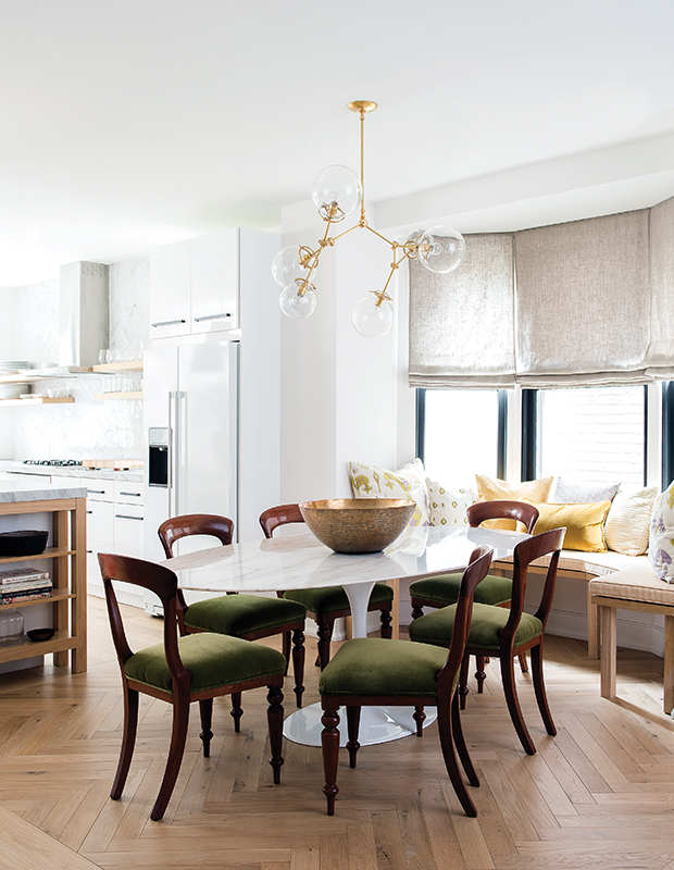
To complement well loved family heirlooms, designer Sam Sacks upholstered her client’s mahogany dining chairs in a classic olive velvet that will only look better with wear.
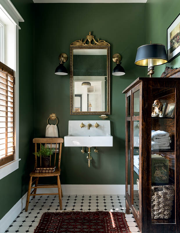
A deep shade of green complements a glass-front cabinet with knick knacks and bathroom essentials in this powder room.
House & Home October 2021