Before & After
June 26, 2023
A Vancouver Craftsman Gets A Modern Makeover That Honors Its Heritage Roots
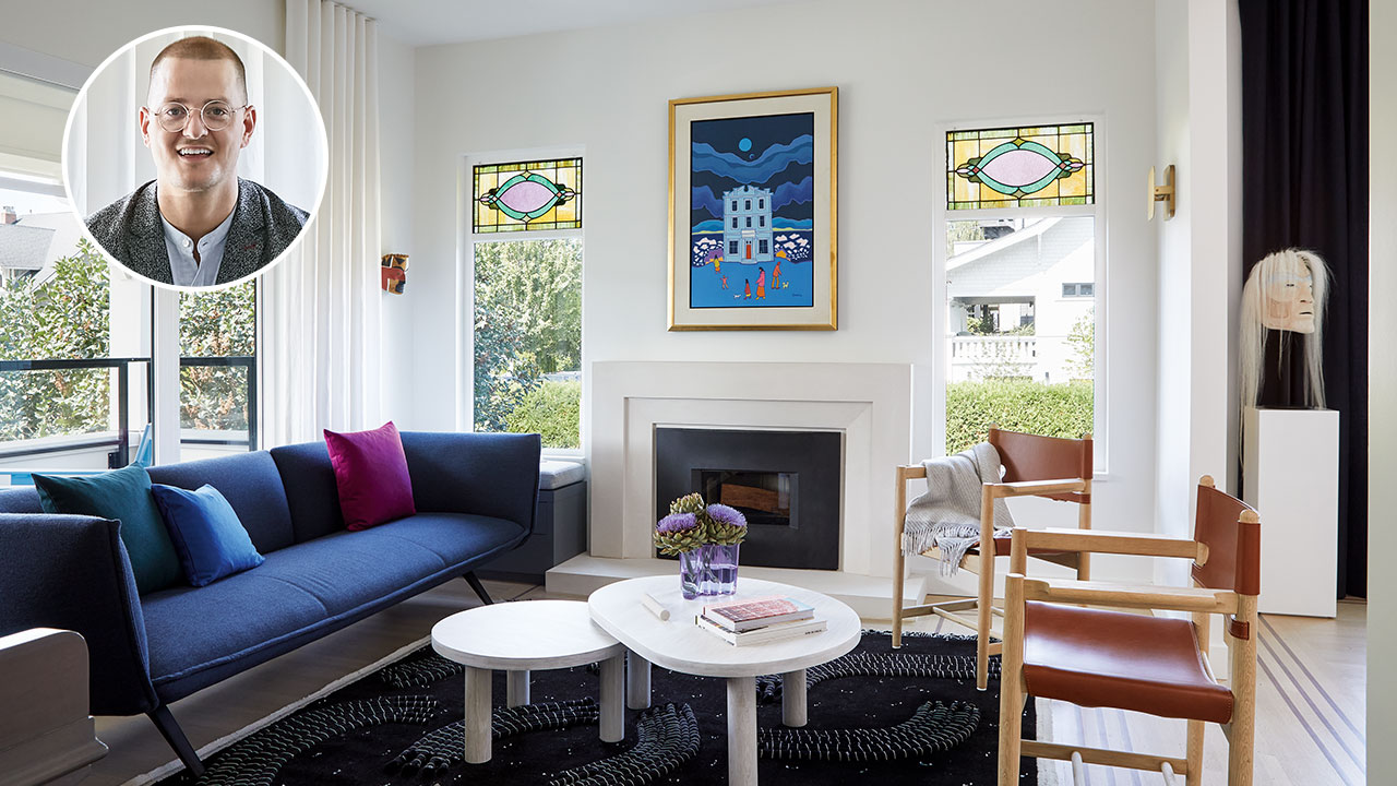
Lawyers Claire and Matthew Good adored their beachside Kitsilano neighborhood in Vancouver — but their new house, not so much. In fact, it was uninhabitable. “The kitchen and bathrooms were straight out of The Shining,” deadpans Ben Leavitt, the creative director of design firm PlaidFox Studio. With architect Jason Skladan, Ben was enlisted to transform the neglected, century-old Craftsman into a modern family home. Over a 21-month renovation, the 3,500-square-foot, five-bedroom, five-bathroom house was stripped to the studs, hoisted to shoehorn in a full-height basement, then designed and decorated with modern details and sassy colors.
Scroll down!
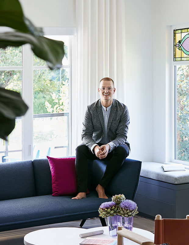
House & Home: How did you come to work on the interiors?
Ben Leavitt: I met Claire and Mathew through Jason, who’s a good friend of mine. He told me they were super fun and that our personalities would jibe — they love color like I do. It was a perfect match! In one of our first design meetings, Mathew asked if there was anywhere we could put a slushie machine.
H&H: Jason, this house was renovated, inside and out. What was your overall goal?
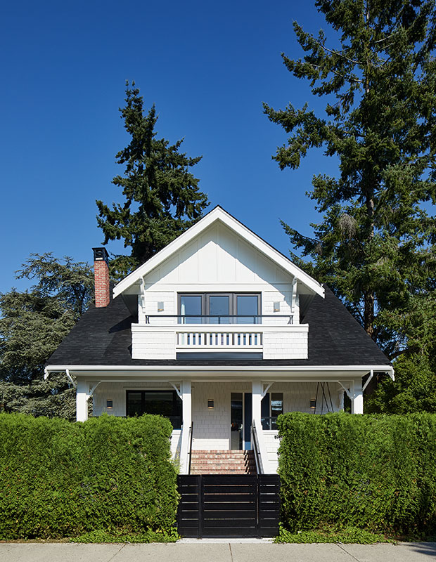
Jason Skladan: Outside, we wanted to restore the exterior character of the Craftsman house. Stucco was replaced with classic shingle and plank cladding, and new brick porch stairs with robust wood railings were added.
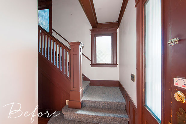
Before: A carpeted floor in the entrance seemed impractical and old-fashioned.
“This house had four previous renovations and wasn’t left in the best condition, so there was the temptation to remove everything, but we wanted to make sure the heritage spirit still shone through,” says Ben.
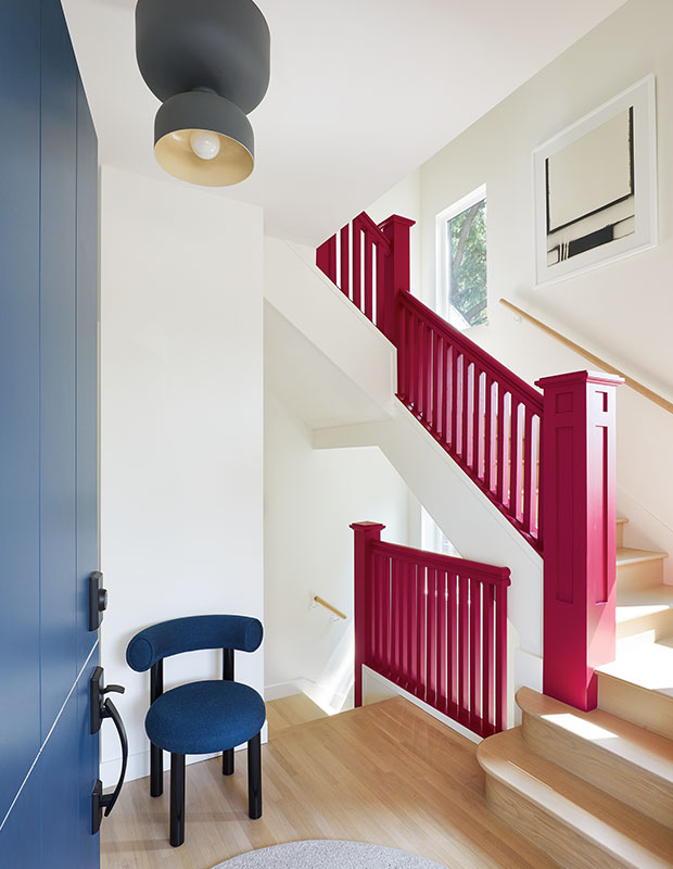
After: The original staircase, with the railing now in magenta, is an eye-catching focal point in the foyer.
H&H: What elements did you keep?
BL: Retaining the house’s historical feel was important. We sanded and bleached the original floors to a white oak, and the stained glass inserts were kept. The staircase was refinished and the banister rail sprayed in a fun fuchsia. We did introduce subtle new archways to divide the rooms so, when entertaining, it’s not just one big space — each area feels unique as you travel through the house.
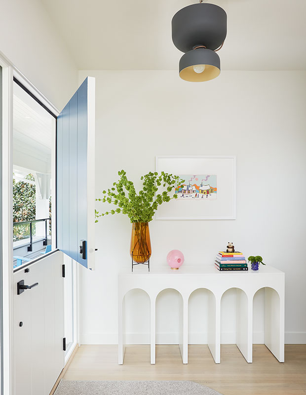
A cobalt blue Dutch door is a cheery welcome at the entrance and hints at the eclectic interiors.
“When you’re working on a historical home, no matter how much planning you do, when the reno starts, there are a lot of adjustments,” says Ben.
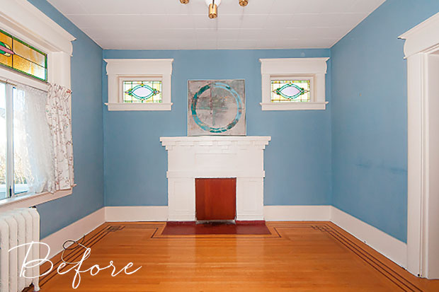
Before: The existing fireplace was no longer in working condition and needed a complete overhaul.
H&H: What were the biggest challenges during the renovation?
JS: The original basement was unfinished for more than 100 years because of the low ceiling height — Mathew could not stand fully upright. It was depressing and slightly scary. We lifted the house to create a lower level with a family room, guest space and a one-bedroom nanny suite with a sunken patio. Keeping the existing chimney while lifting the house was a challenge. Thanks to a talented brickmason, the chimney was restored and fitted with a wood-burning fireplace insert.
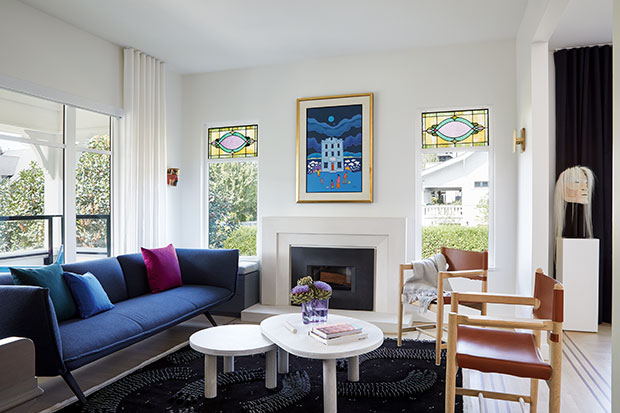
After: The vibrant blues and purples in the living room feel fresh and youthful.
“Inside, we brought in new windows, incorporating some original stained glass inserts, and the existing chimney was salvaged and repaired. Kitsilano is filled with Craftsman and Edwardian homes from the early 1910s. We wanted to update the house sensitively for a modern family who love color but didn’t want to overwhelm the neighborhood on their highly visible corner lot,” says Jason.
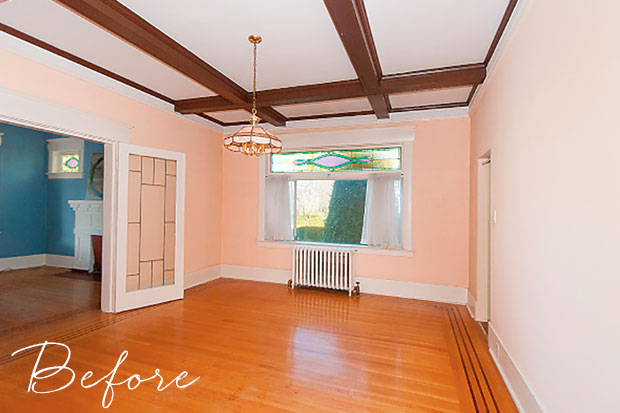
Before: “The house was a diamond in the rough, but it had good bones,” says architect Jason Skladan. “Before the reno, it was covered head-to-toe in stucco and 1960s panelling.”
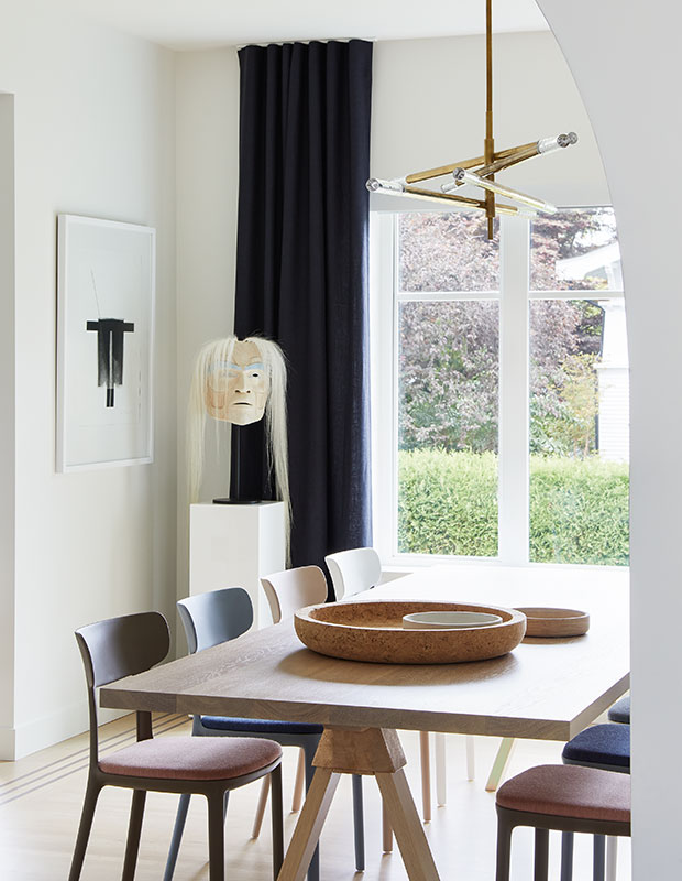
After: Navy drapes add a grounding element in the light-filled dining room.
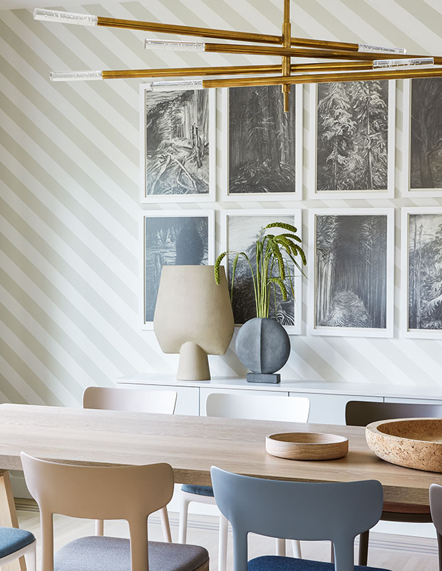
“Claire and Mathew also love Canadian art. In the dining room, they have original charcoal drawings by Jack Shadbolt, and the painting above the fireplace is an original Ted Harrison they bought at auction. Its bright, vivid colors were a huge inspiration for the decorating,” says Ben.
H&H: Your biggest splurge and best save?
BL: Lifting the house and adding the basement were significant costs. The artwork was also a splurge. We saved by keeping the floors and banister railing.
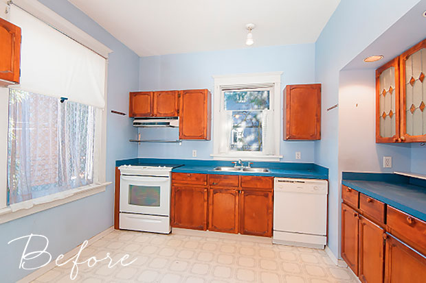
Before: The kitchen featured outdated appliances and worn out cabinets.
H&H:What was the design brief?
BL: They wanted a modern meets traditional jewel box, where every element felt distinctive. The main floor is more traditional, and the upper floor displays a maximalist version of minimalism. Since they both love art and color, they wanted us to find a unique way to make it feel young and lively while also keeping the original traditional elements alive.
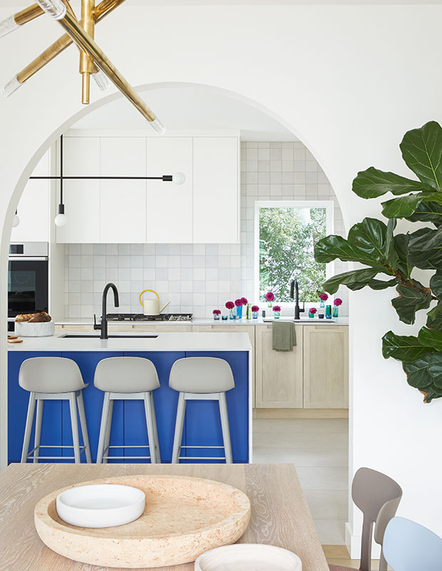
After: The island’s bright blue facing animates the immaculate white kitchen, and the black linear light fixture has graphic punch.
H&H: What’s your approach to decorating with color?
BL: Though pattern and color were major driving forces within each space, we tried to use a single color on one statement piece to leave a lot of breathing room for other elements. I love working with modern furniture in a historical home because of the juxtaposition. And I love the way paint totally transformed the house: the addition of stripes in the dining room — which has such optimistic energy — and the electric Cookie Monster–blue island. Paint is powerful.
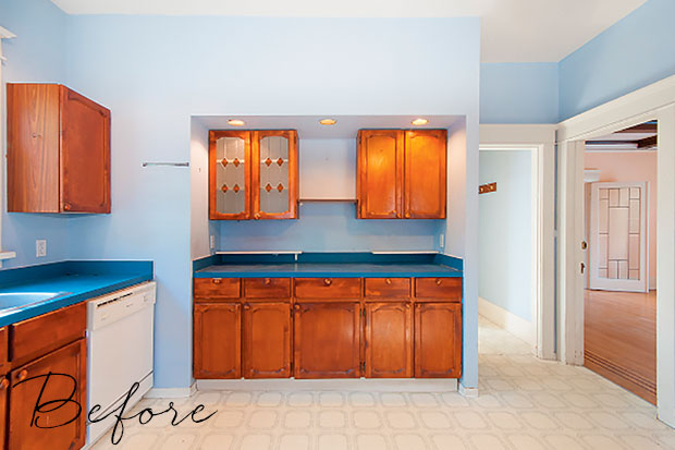
Before: The pale blue wall paint gave the dated kitchen a washed out look.
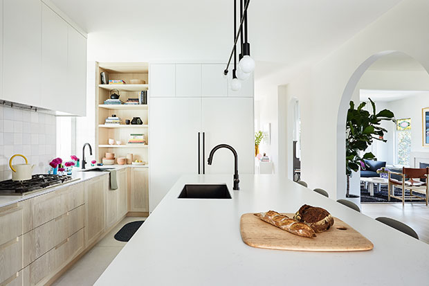
After: White walls, blond wood millwork and light counters create an airy kitchen that marries modern and traditional styles.
H&H: Do Claire and Matthew have similar styles?
BL: Mathew prefers a more minimal, super-clean look. He’s influenced by Scandinavian and Japanese design. Claire likes color and is more traditional. The marrying of their styles is most evident in the kitchen: there’s the linear metal light fixture, then the upper cabinets are an ultramodern flat-panel. In contrast, the lowers are white oak Shaker style, and there’s the more traditional hand-pressed Spanish tile.
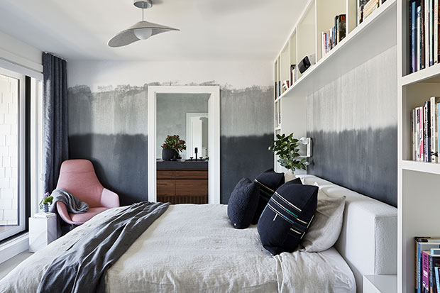
H&H: Your adventurous design style pops in this house — it’s lovely!
BL: Your home should speak to who you are and your style. If you’re young, interesting and charismatic, why would your house be ultraminimal and white? This home is a true reflection of the family that lives here.
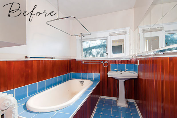
Before: The principal bathroom featured an outdated built-in tub.
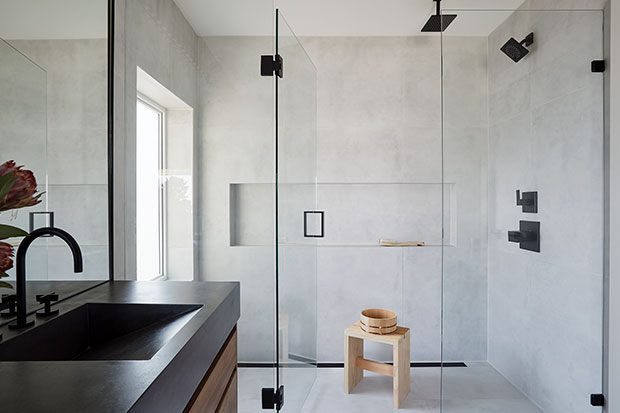
After: Wrapped in large-format grey tile, the sleek ensuite shower enclosure is like a calming spa.
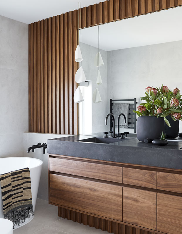
An integrated cast concrete sink and slatted walnut wall and vanity bring warmth to the Japanese-inspired ensuite.
H&H: What do you love most about this project?
BL: Claire and Mathew love the banister and the Dutch door — so functional and fun. Mathew’s also a fan of the principal bathroom. He’s a big bather and loves to chill in the tub with some wine. The window above overlooks a view of the ocean. For me, I love the interesting pieces, like the Spanish chairs in the living room.
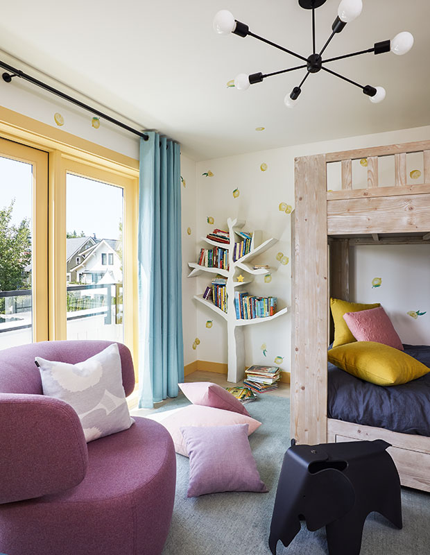
Daughter Zoe’s bedroom is filled with fun elements including an oversized, futuristic-looking wool chair, perfect for story time.
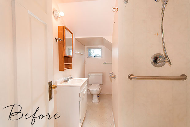
Before: The kid’s bathroom lacked personality and color.
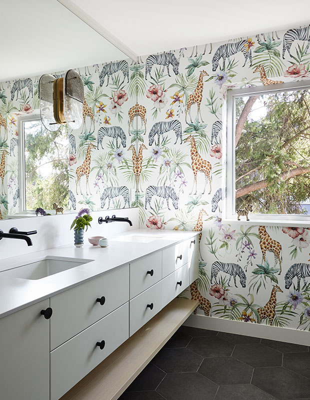
After: With its gambolling giraffe wallpaper, the kids’ bathroom reflects their love of safari animals.
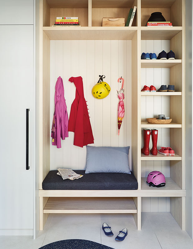
The mudroom comes in handy for the kids, Zoe, 7, and Olin, 5. “Some of the storage is open so it doesn’t feel claustrophobic,” says Ben.
Ema Peter
Stacy Begg
Ben Leavitt; Architecture by Jason Skladan